Bright, bold, brave & fearless – Pantone Color of the Year Viva Magenta is crimson in tone, balanced between warm and cool. Viva Magenta is “a pulsating color whose exuberance inspires optimism & joy.”
Viva Magenta
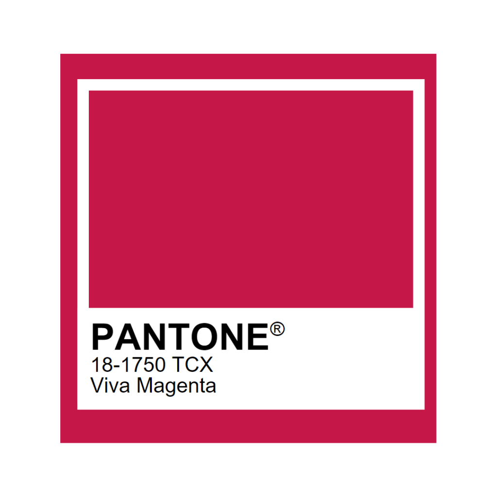
Pantone’s Color of the Year, Viva Magenta 18-1750, vibrates with vim and vigor. It is a shade rooted in nature descending from the red family and expressive of a new signal of strength. Viva Magenta is brave and fearless, and a pulsating color whose exuberance promotes a joyous and optimistic celebration, writing a new narrative.
What is Viva Magenta?
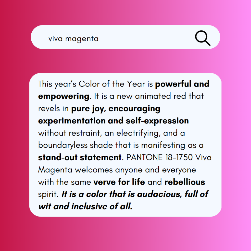
Viva Magenta is powerful and empowering. It makes a statement. It’s a new shade of red that “revels in pure joy, encouraging experimentation and self-expression without restraint, an electrifying, and a boundaryless shade that is manifesting as a stand-out statement.”
Pantone chose Viva Magenta for 2023 Color of the Year due to its versatility and connection to the natural world. The resilient & energizing shade invites changes in perspective, and can be found in nature from beetles to sunsets. Viva Magenta is found in popular media, too – like movies, video games, and social media.
The color we select to be our Pantone Color of the Year is bigger than one region or one sector of design. It is a color we see crossing all areas of design; a color that serves as an expression of a mood and an attitude on the part of the consumers, a color that will resonate around the world, a color that reflects what people are looking for, a color that can hope to answer what they feel they need.
-Laurie Pressman, Vice President of the Pantone Color Institute
Designing with Viva Magenta in Mind
Viva Magenta inspires the curiosity in us.
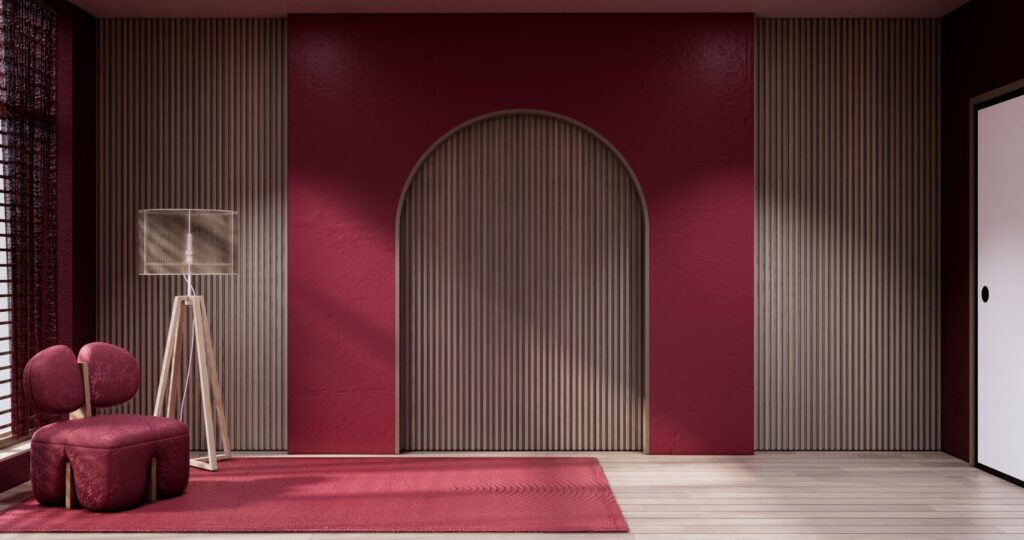
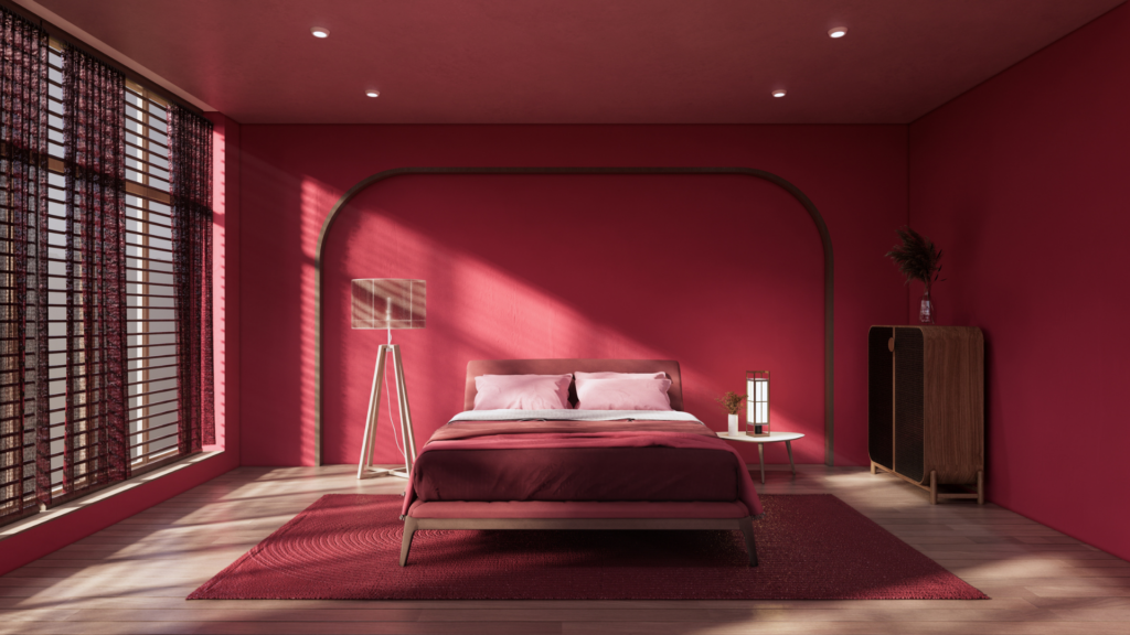
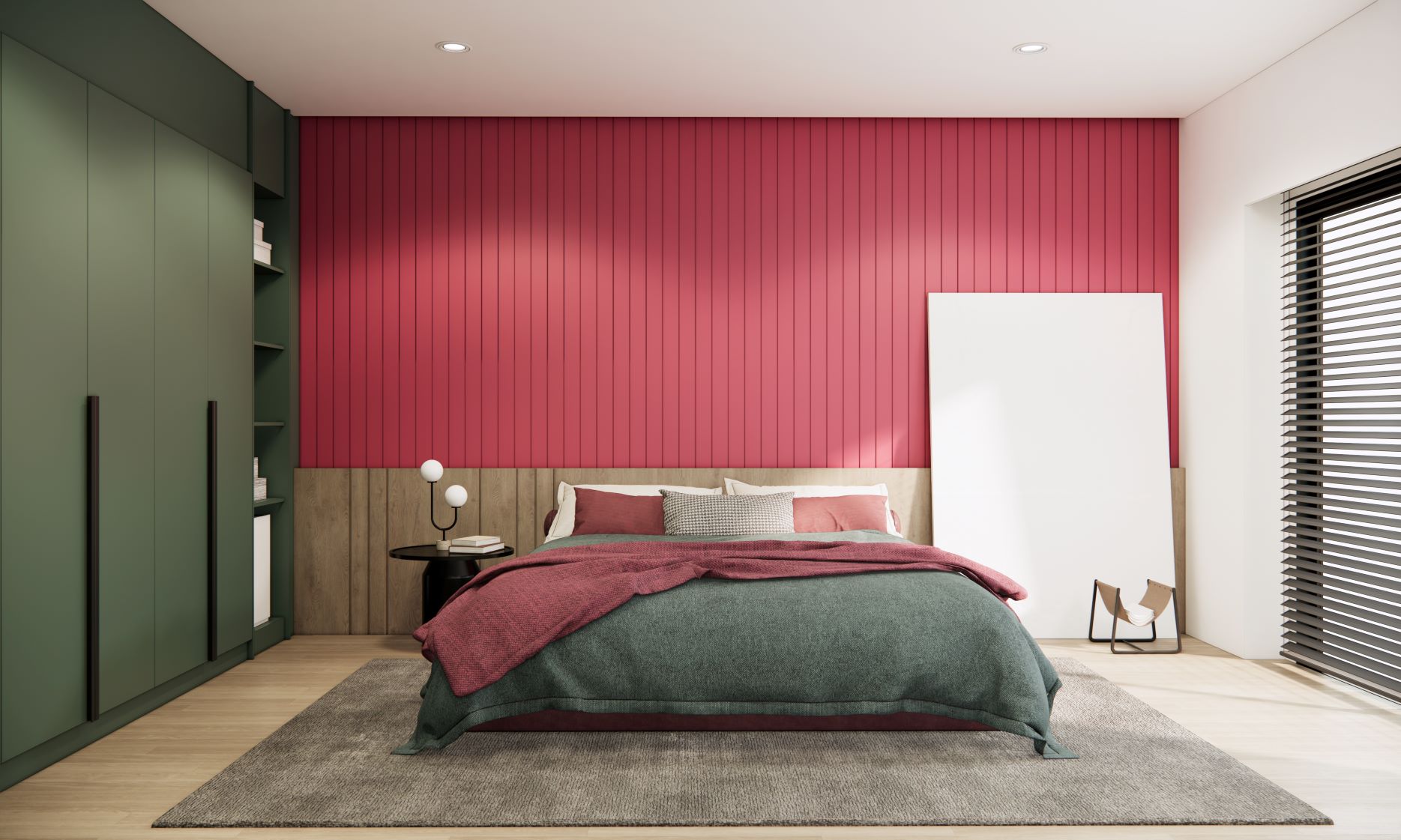
Viva Magenta inspires living boldly & fearlessly. Incorporating Viva Magenta into interior spaces feels almost rebellious. Although Viva Magenta can feel intimidating to incorporate in designs, it pairs well with pastels, natural wood tones, and our new metallic accents.
We’ve curated palettes, a selection of products, and an inspiration gallery to inspire the Viva Magenta in you.
Palettes
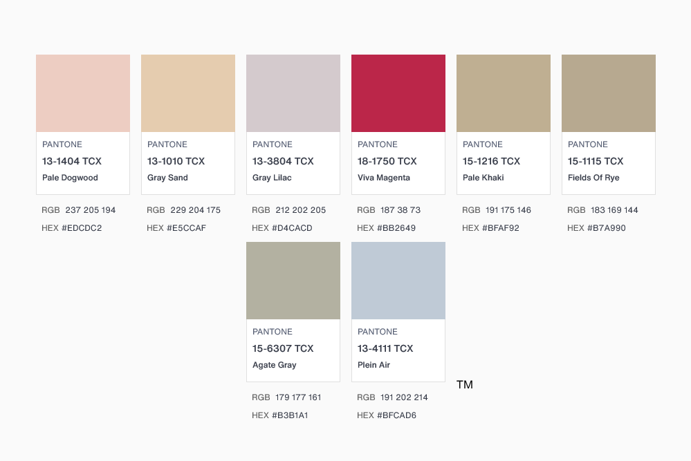
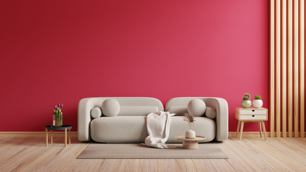
Muted & Pastel: Viva Magenta pairs well with muted & pastel hues, including khaki, lavender, and light blue tones. From textiles to textures, incorporating lighter tones with Viva Magenta invites creativity. Wood tones including White Oak and Hard Maple round out a muted/pastel Viva Magenta palette.
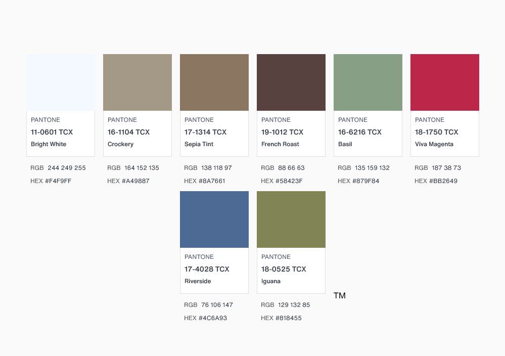
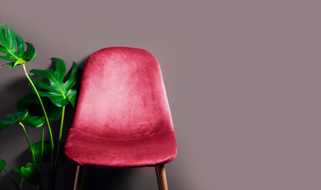
Organic: Natural greens and browns bring out the bright in Viva Magenta. Incorporating natural elements like plants and rattan work well with an organic Viva Magenta palette. Woods like Walnut with warm bronze or polished brass metal accents pair seamlessly with an organic Viva Magenta palette.
Products
Viva Magenta pairs seamlessly with natural wood elements & metallic accents. We have components to add texture, character, and shine to Viva Magenta designs.
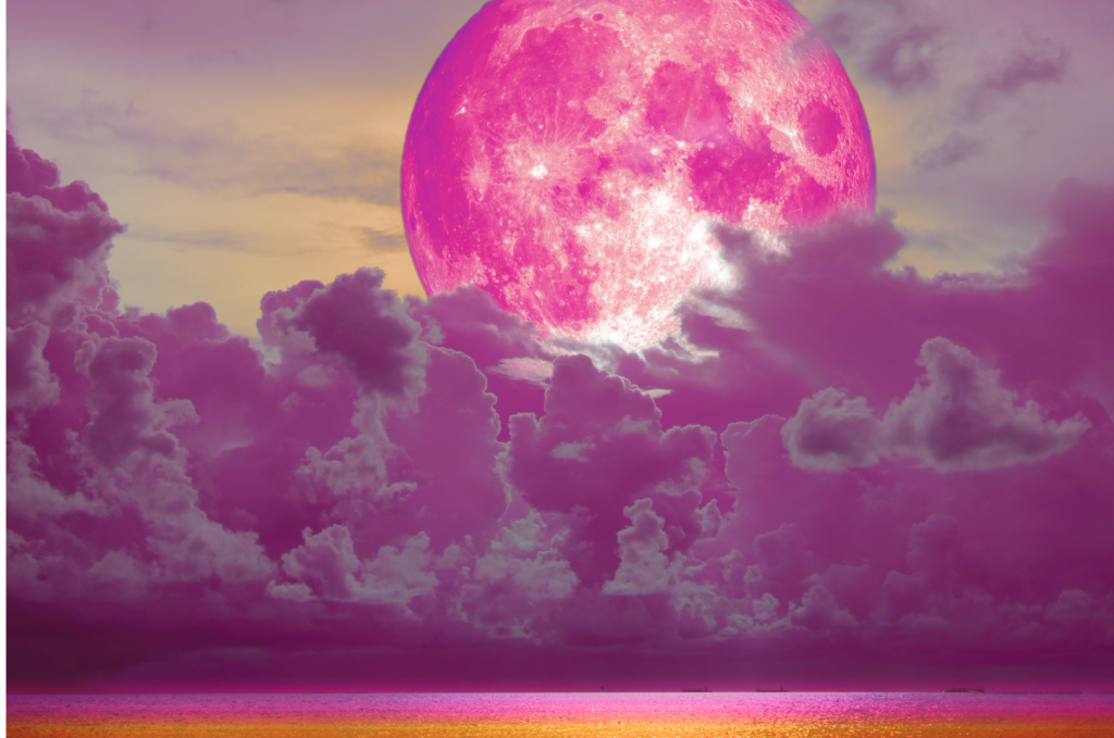
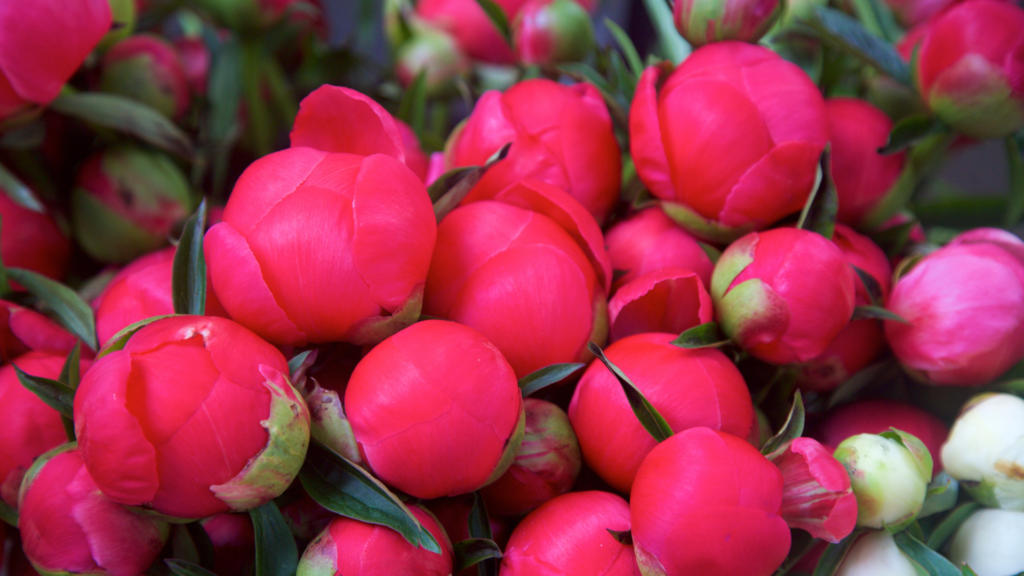
Inspiration Gallery